Oliver’s Battery Countryside Group
I produced an identity for Oliver’s Battery Countryside Group (OBCG), which encapsulates their conservation achievements and community spirit. I kept everything local, from the brandmark hinting at a nearby butterfly reserve, to using imagery from the conservation area in Oliver’s Battery.
This project has been featured on Identity Designed and in Computer Arts issue #206 as part of the cover feature, Delight your clients every time.

Brandmark
The concept arose from symbiosis; a nearby butterfly reserve relies on the group’s conservation area for habitat. The butterfly wings form the shape of the initials “OB”.


Typeface
I developed a hand-drawn display face to match the grassroots nature of the organisation. It features alternate glyphs for variation. This is combined with Clarendon for body text.


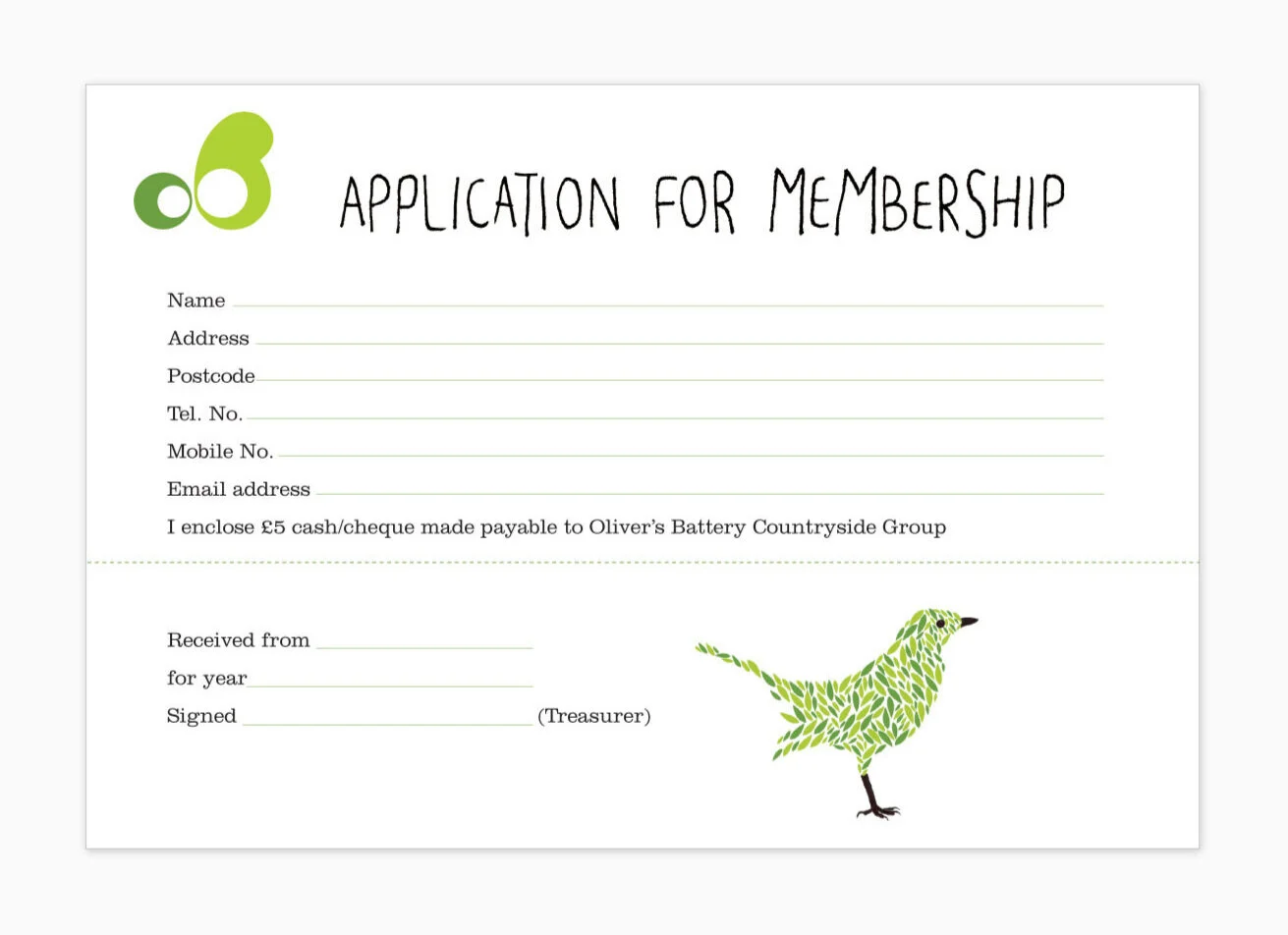
Illustration
I created animal characters made with small leaf shapes to represent the idea of the community coming together to achieve great things. They were originally used only on the application for membership form but became a talking point and so were used throughout other printed material.


Event invitations
I sourced photographs of the local area for the event invitations. I assisted with copywriting to excite local people to join in, keeping the tone of voice inclusive and encouraging to reinforce the sense of community.


Application for membership
The application form is often the first touch point for new members. I included the animal illustrations on it to add intrigue and create a friendly welcome.