England On Tap
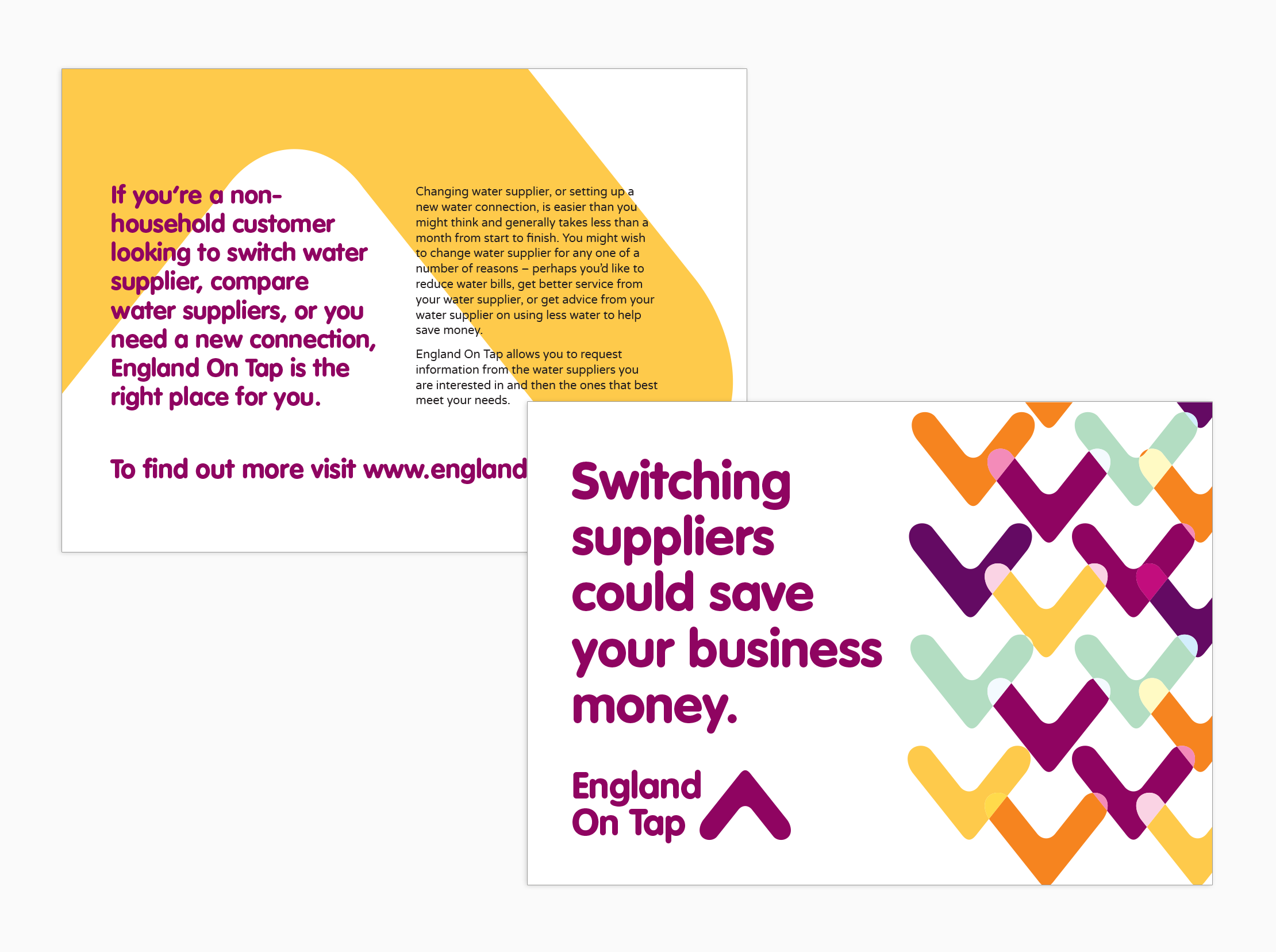
The brand identity for utilities switching service England On Tap needed to be distinct from its Scottish counterpart. I created a modern and bright identity with a brandmark derived from the shape of a water molecule’s bonds.
Brand identity
I developed a brand identity specifying typography style, a colour palette and vector patterns. I used the shape of the brandmark to create a colourful pattern that could be used throughout the brand’s application.