A History of St Paul’s
I economically designed and typeset a book about the history of a school. Drawing on my knowledge of typography, I designed it to be both elegant and easy enough for pupils to read.
Cover
The author requested that a specific watercolour image of the school by local artist Chris Forsey be used for the front cover. I wrapped it round the cover and used simple typography seen throughout the book for the titling text.
Alternative cover design concepts:
Typography
I used Minion Pro for the primary type family and Gill for the secondary. Minion suits the nature of the book and has an extensive character set including small caps and non-lining numerals which the text required. Gill complements Minion as it is also built on humanist foundations, and exudes a traditional British air.
Contents
I used right-aligned chapter numbers in the contents to make them less intrusive. Front- and back-matter was clearly denoted by using small caps.
Introduction
To balance the introduction spread I aligned the two columns horizontally. This creates an elegant, considered start to the book.
Chapter opening
Each chapter begins on the recto page with an over-sized chapter number and spaced uppercase title. These appear one-third the way down the page to create breathing room between chapters.
Grid
I placed text and image on an asymmetric grid. I flowed the images through as part of the text (aligning them to the bottom or the top of the text area) to ensure the reader didn’t miss any information. Footnotes appear on the same page for easy reference.
Maps
I rotated the larger maps through 90º to ensure they were easy to read. This achieved the best compromise between readability and economical use of space.
Bibliography and index
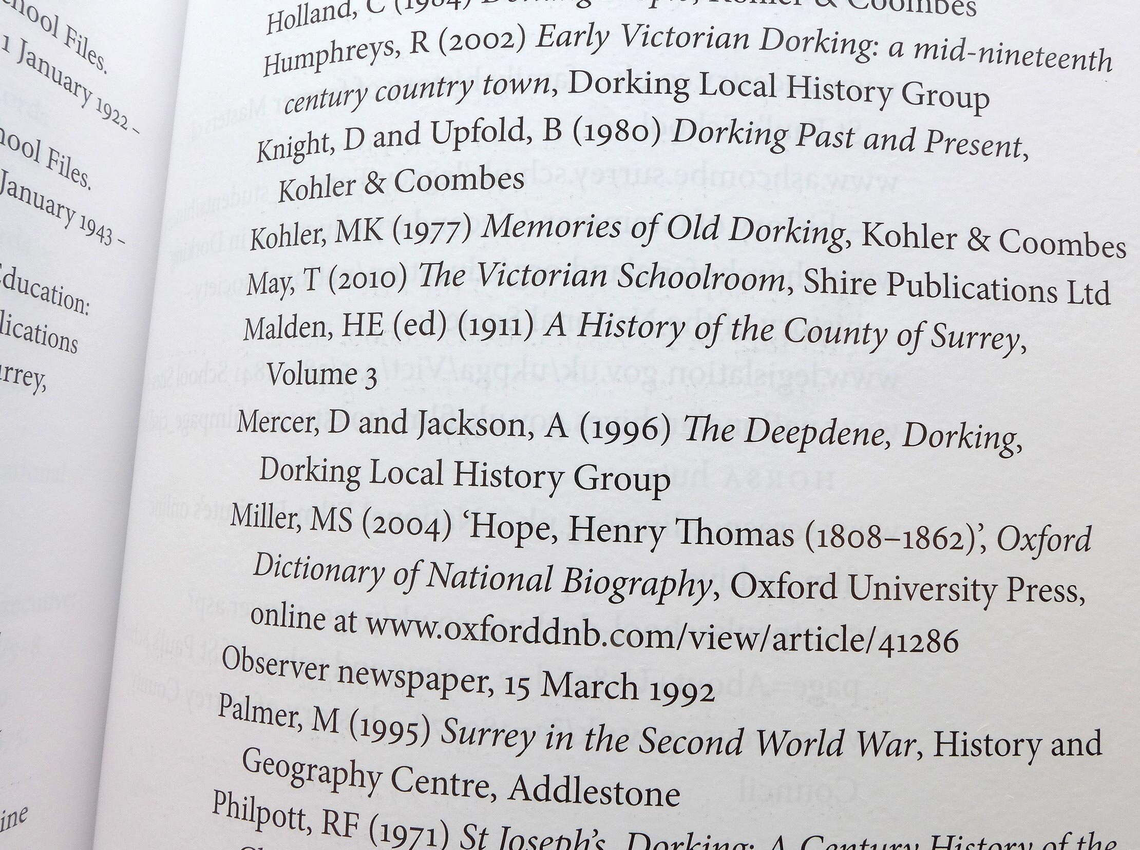
I typeset the bibliography and index paying special attention to typographic rules including numerals and small caps.
To make better use of space, I set the index in smaller type at 7.5 / 9.5 pt (the body text is 10.25 / 14 pt) and used a two-column layout.


